Interstate in Spring
Interstate in Spring
I began this project at the request of ABC Life Literacy almost 2 years ago. I had wondered exactly how I would create an alphabet that would work within my existing studio practice and would have its own trajectory outside of the system I operate within, that is, galleries and collectors — paintings, photographs and drawings.
At some point I decided that this project, the alphabet, should be treated as a work of art first and then from that find a way to solve the question of individual letters; ABC sells individual letters to its sponsors.
In the early summer of 2010 I rode my motorcycle from Toronto to Santa Monica and then up the west coast of California through Oregon and Washington into Vancouver. From Chicago to the Santa Monica Pier, my brother and I followed the original route 66 as much as possible, however, there are many instances where one has to use the interstate system. I fell in love with the typography of the Interstate signage, a font developed for this system of roads called “Interstate”. In 2010 we began using interstate for some of the larger text works, which have been part of exhibitions and publications since 2001. It seemed logical to me to extend that affection for this typeface as a starting point for solving the project for ABC.
The final work for the studio was a single image of the entire alphabet, a vertical work with the Z’s placed on the bottom right. The question of the individual letters as single works is drawn from my own memory of learning to print in primary school. Cards with individual upper and lower case letters would be circulated through the classroom. I remember that these letters had a raised felt texture, which we would trace with our index finger. All 26 letter cards would be circulated and then placed back around the class like a frieze. The exercise would be repeated, all 26 letters in both cases but this time in our orange notebooks with our oversized red printer pencils, 3 lines for a capital and 2 for a “small” letter. I think it was grade 1.
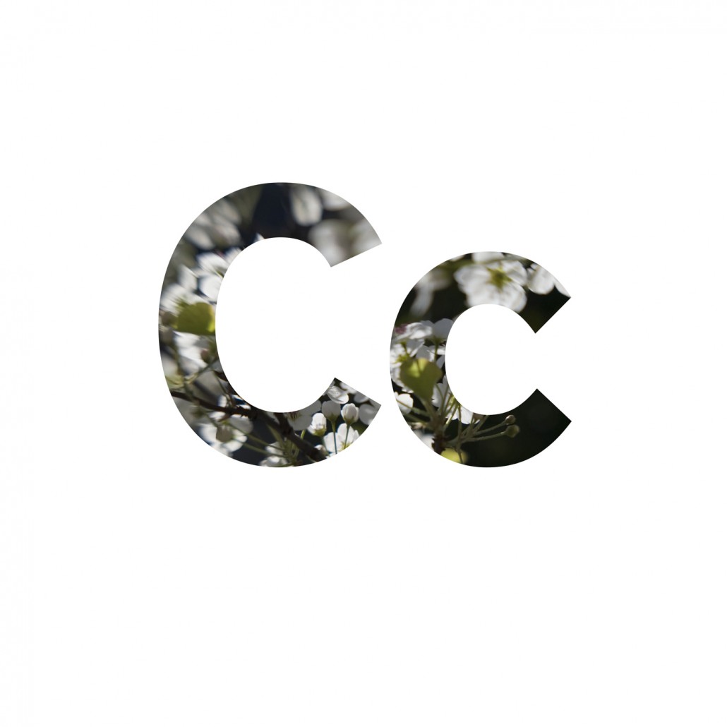
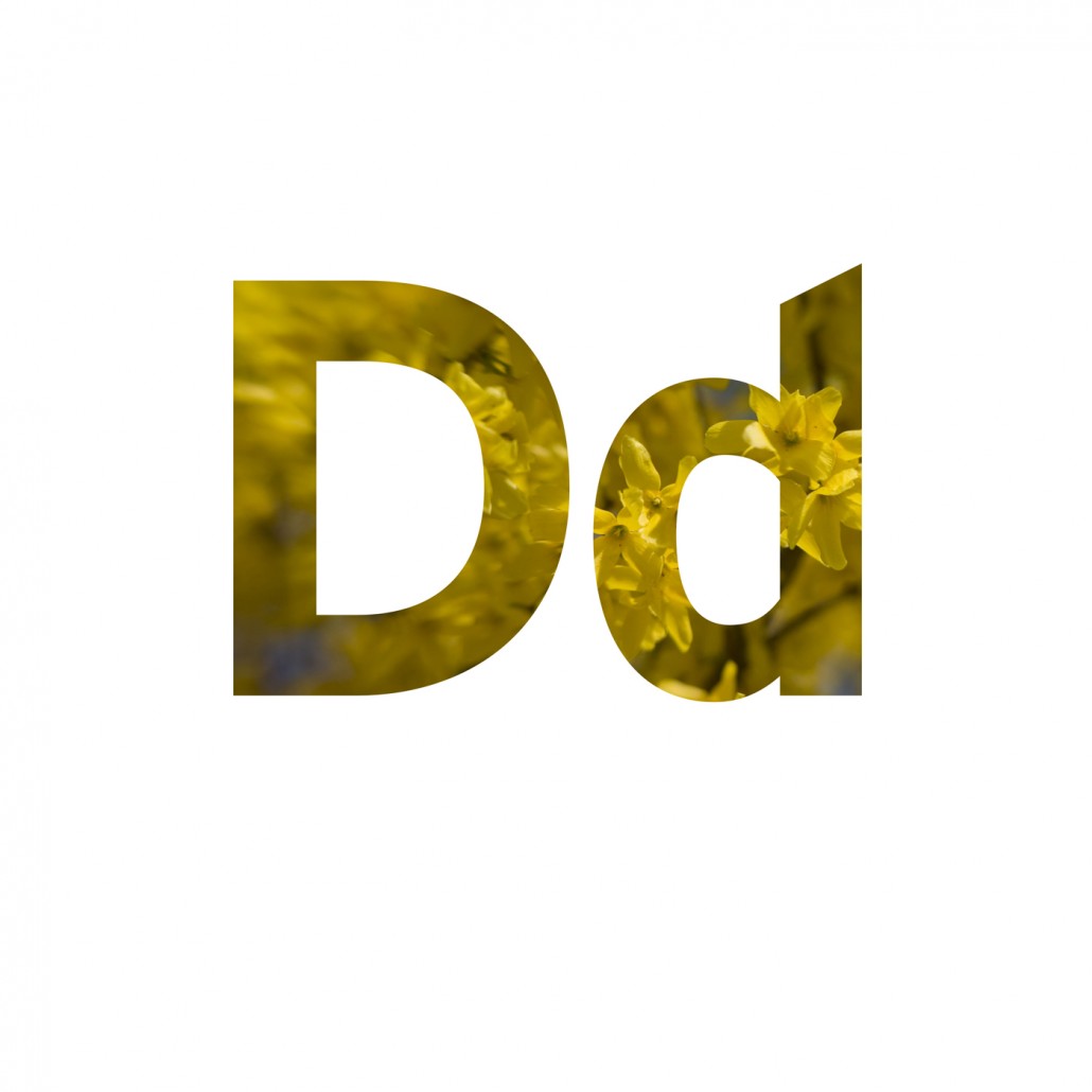
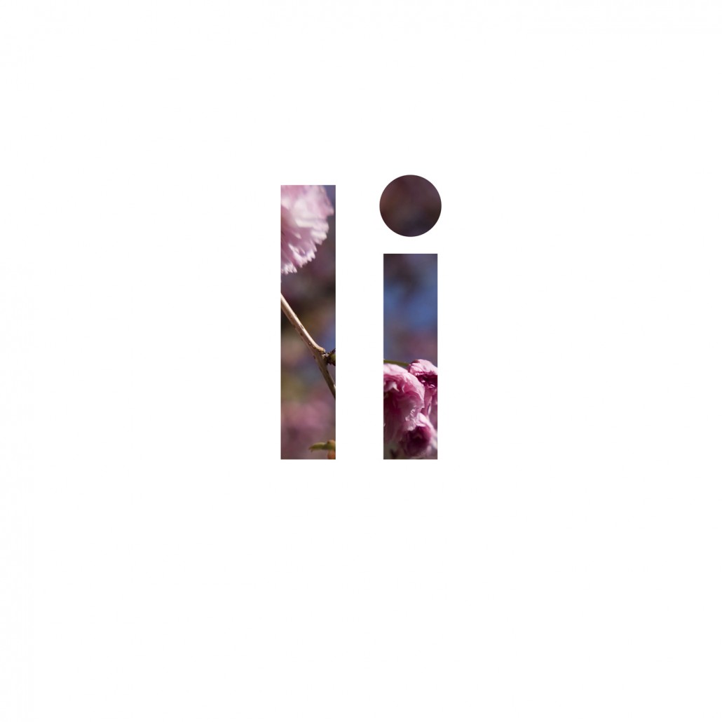
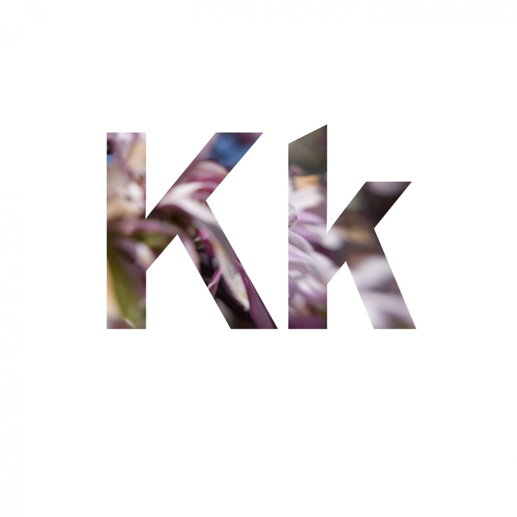
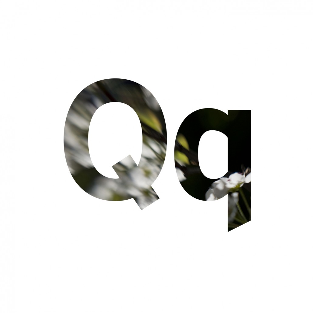
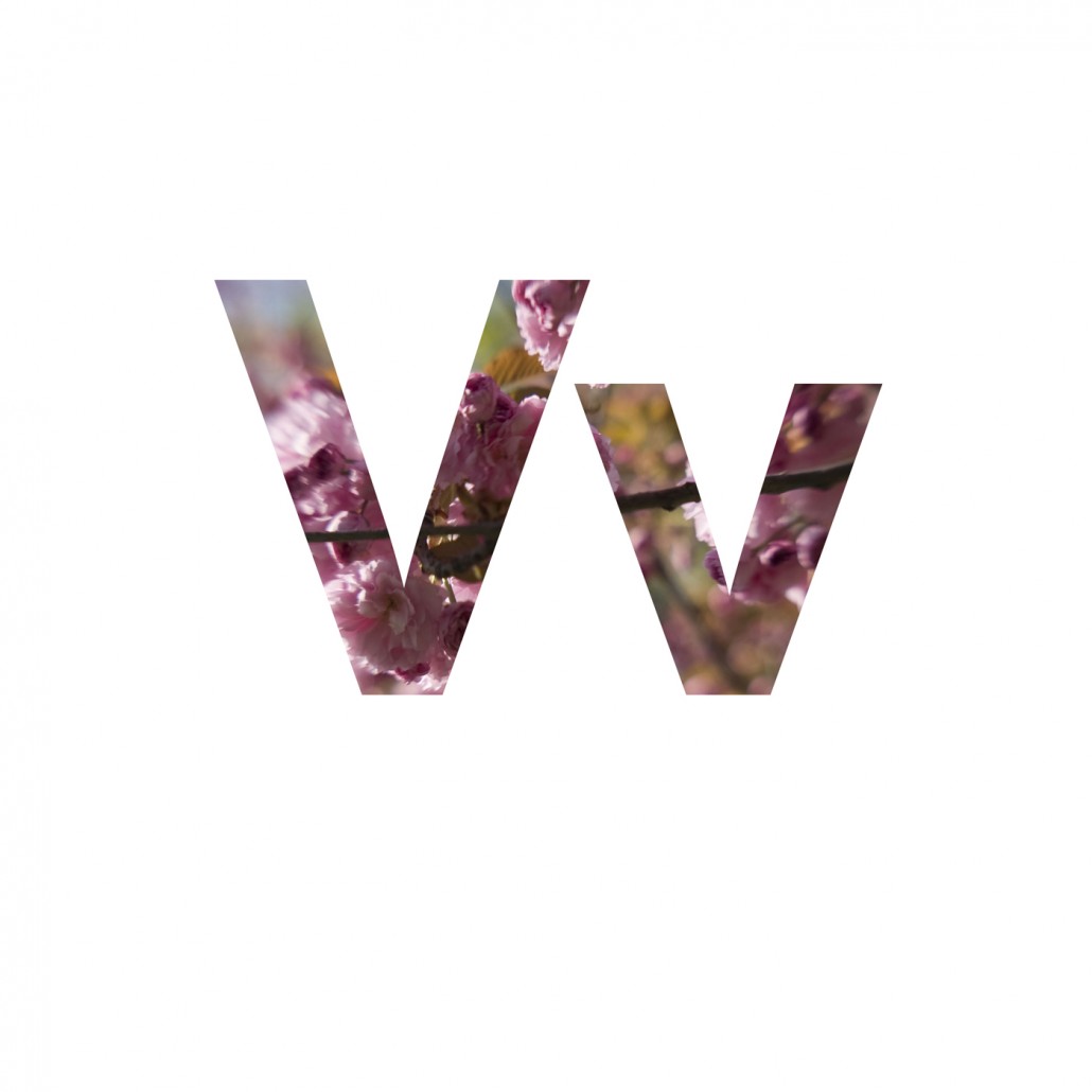
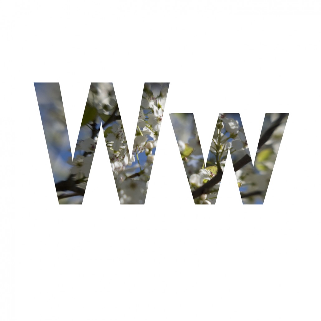
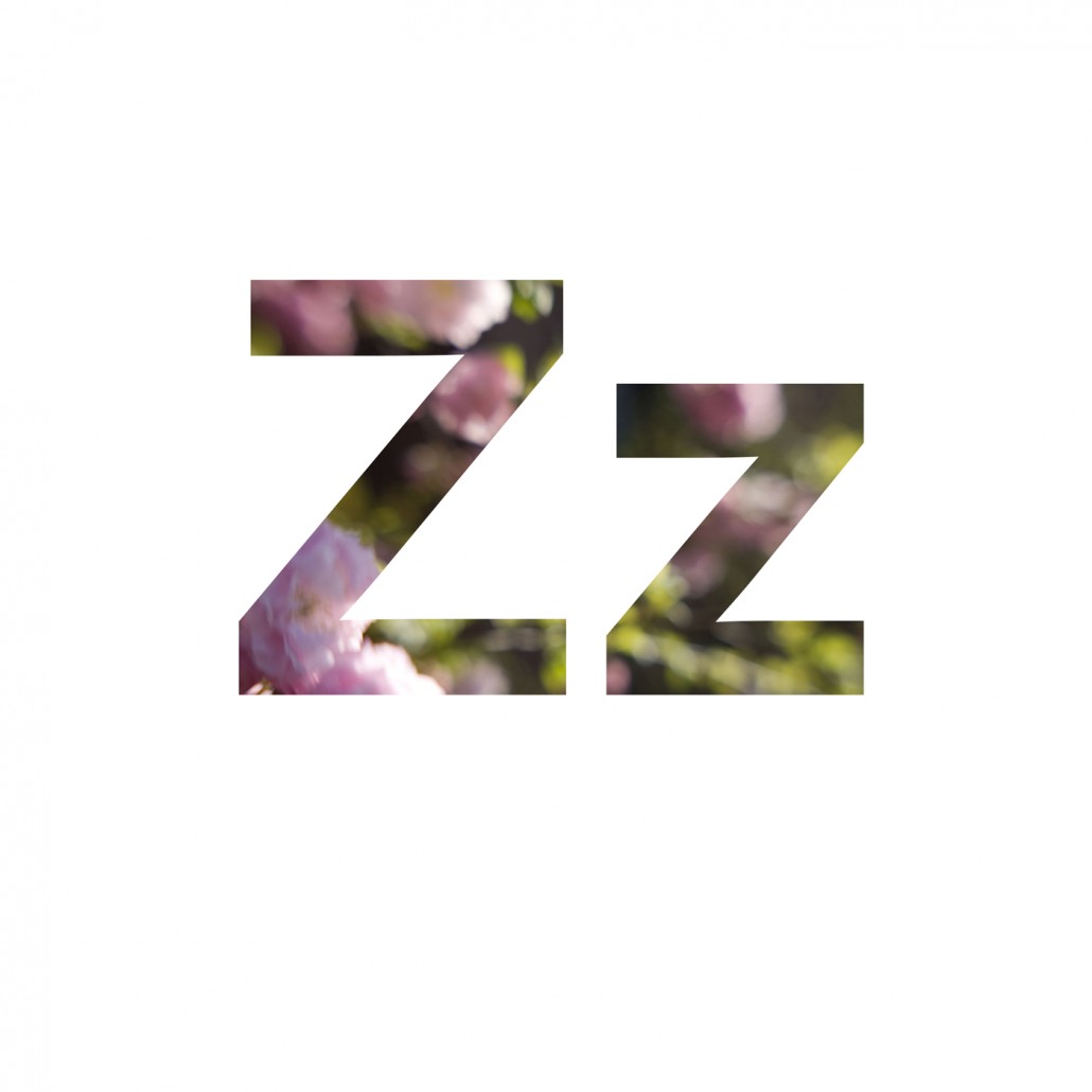
The idea that an adult would re-engage with learning, that gesture of optimism, to me it deserved a project that had at its essence two linked themes; communication and renewal. Interstate was developed precisely for its clarity, its ability to communicate and the imagery I imposed on this slightly adjusted version of the font is entirely made from images of trees blooming in spring, that moment of renewal, faith, optimism.
James Lahey
Summer 2011
Works from the Project